
Watch Out! App
- Lead Product Designer and User Researcher -
Watch Out! is a mobile application designed to combat inefficiencies in the product recall process. Currently, many companies or manufacturers of products (ranging from automotive, household appliances, food, children's toys, etc.) do not know the final destination of their product or who actually owns their product. In the event of a recall, these companies are often unable to reach the consumer. Watch Out! serves as an intermediary service that alerts consumers of products they use that have been recalled and as a channel of communication between manufacturers and consumers.

Constraints
Sole user researcher and product designer
Thrifty user research budget
Worked simultaneously in research, design, and product management roles
Worked simultaneously on other projects including nationwide Watch Out! Fuel pump rewards integration and business portal which allows businesses to send targeted rewards to users

Tools
Sketch
Illustrator
Photoshop
Invision
Pollfish
Zeplin

Feedback Highlights
”There are too many places to add products and I don't know where I should be doing this”
“I’m not sure how to share a general alert"
“There are too many recalls for me to sort through in the ‘view all’ section"
“Where is the section that is tailored to me?”
”This is difficult to understand and hard to read”

Process
Research - Surveys
Communicate Findings
Defining the Problem
Usability Assessment
Brainstorm Solutions
Product Concept, UI/UX, and Rapid Prototyping
Test & Ship
End Results

Background
The idea for a consumer safety app was born while working with Frequentz, a global leader in serialized data warehousing, traceability, and information management solutions. Our customers (Costco, Metro Group, Nestle, etc.) were able to track outbreaks like salmonella, e.coli, listeria, and more down to the lot, batch, and unit level. Using Frequentz’s traceability products allowed businesses to quickly track recalled products back to the source of the problem and prevent the further spread of a potential hazardous product.
Real-life example: Our technology was able to identify a certain brand of peanuts that was linked with a salmonella outbreak and we were able to notify Costco to pull the package of peanuts from their Chinese Chicken Salad before it hit the shelves.
There is great value in tracing recalls upstream to find the source of an outbreak but often times it takes weeks to find the root cause. The problem is that perishable products, like produce, are often consumed within the same week they’re purchased before businesses can react to pull products off shelves. At this point, an affected product would have already been consumed and the damage already done.
“How can we solve for this information gap?”
We realized that if we are trying to prevent the spread of recalled products we cannot solely rely on businesses to remove affected products- we need to be able to reach consumers directly and empower them with information. This was a massive, untapped opportunity that was underserved and ultimately led to the spinout product Watch Out!.
Watch Out! was originally designed to serve as a recall awareness mobile app with alerts that are tailored to the user. For example, if a user wants to 'watch out' for their 2018 Tesla Model 3 then they are able to add this vehicle to their 'WatchList' and receive all alerts relevant to the exact model they specified. Conversely, users can also add broad groups of products, like spinach, chicken, or strollers to their ‘WatchList’ for notifications.

The MVP allows for:
Adding and managing items users want to monitor
Receiving notifications about affected items
Viewing all recalls across all industries
Sharing alerts and recalls with others
After the MVP was completed and shipped to beta users it was important to assess the usability of our mobile app.

Research
Determine User Needs
Step 1: Survey - Who are we helping?
I wanted to start from square one. Are we truly solving for a problem that exists? My goals were to assess peoples general understanding of safety/recalls and determine (1) if there is a genuine concern, (2) what the main concerns are, (3) who is most concerned, and (4) how consumers currently learn about recalls.
I wanted to reach a large, random, demographically and psychographically representative audience of non-users. A report concluded the top 10 most statistically representative cities in the U.S. so I selected 5 of those cities to send a surveyor.
Key Takeaways
48% of respondents ranked recalls as a major concern (4 or higher out of a possible 5)
Consumers associate ‘recalls’ with:
Automotive Industry
Food Industry
Pharmaceutical Industry
Products (New)
The strongest early adopters:
Have Children or Dependents
Own a Home
Own a Vehicle
Have a Pet (New)
Note: Over 83% of female parents and 80% of male parents that own cars are “Concerned” or “Very Concerned” about recalls. This is significant compared to roughly 48% of all survey participants who were “Concerned” or “Very Concerned” about recalls.
Consumers primarily receive recall information from the following:
Mail
News
Email
Phone Call (New)
Note: Awareness and access to the right information is lacking. Over 60% of Car-Owners have never heard about the Takata airbag recall. In the U.S., 69M vehicles are part of the Takata recall. The Takata Airbag recall is “the largest and most complex safety recall in U.S. history” (NHTSA). The overwhelming majority of people had learned about a recall via Mail (over 57%). However, when asked about their preferred method of learning about a recall, three of the top four preferences are digital: via Email (60.1%), Text Message (31.3%), and Mobile App (20.2%).
The first survey gave us a more clear understanding of our early adopters/super users which also allowed us to create more in-depth personas.

Step 2: Survey - Assess Features Among Early Adopters
A deep dive into our most engaged user groups
Key Takeaways:
Almost 85% of respondents with vehicles indicated they would download a mobile app that gave them rewards (including fuel savings at the pump). Of the remaining 15%, 13.5% indicated they would be interested in fuel savings if the discount was high enough.
62% of respondents confirmed they have searched for news regarding a specific recall.
54.5% of respondents indicated they have owned an item that has been recalled while 12% indicated they were unsure.
97% of respondents would share a recall alert with someone they know. 27.5% would blast recall alerts to everyone they know regardless of whether or not they know that the person has the recalled product.
72.5% of respondents were concerned or very concerned about recalls (compare this to the 48% of the general population that was surveyed for survey 1).
Only 28% take their vehicle to the dealership. This underscores the desire for dealerships to work with a partner (such as Watch Out!) to drive more people to the dealership for routine service and maintenance.
The second survey allowed us to prioritize features and build around a core audience.
Communicate Findings
I created personas based on our findings from the surveys and beta user interviews as a way to consolidate and communicate some of the biggest takeaways to our team. As the product continued to grow, it proved to be a helpful reference to ensure design decisions were always based on our core user interests.


Design Process
Based on our user research findings, we developed a problem statement to address the major gaps in user needs that were uncovered.
“How might we create a resource for users to stay aware of recalls that are potentially dangerous for them or others?”
Assessment of the Current App: Usability Tests and Interviews
While conducting user research, I was also simultaneously evaluating the current application based on usability heuristics and user feedback. Does the current app addressed our new problem statement?
Watch Out! already had beta users of the mobile app. This served as a great starting point to determine the current value the product offers and would allow us to assess the current usability status to serve as a benchmark for comparing future iterations. To accomplish these tests, I sat with approximately 20 beta users to conduct usability interviews.
The abbreviated feedback we were receiving from beta users and internal team members were the following:
Cumbersome interaction flow: Users can add products in multiple locations with no clear indication of where the added product resides.
Unclear content: The app does a poor job of showing users which alerts are tailored to them versus the ‘view all’ section.
Takes user out of app: The ‘more info’ section under the recall alert is not native to the app. Instead it takes users to the government source, conferring less value to the Watch Out! app as a primary source of safety information.
Does not encourage sharing: The app does not allow alert sharing from the preview cell.
No ability to filter or search: Making information accessible requires helping users find events they care about easily and quickly.
Terminology and layout is not accessible: The app uses industry specific terms and structure to describe recalls and alerts, making the information unapproachable to many users.
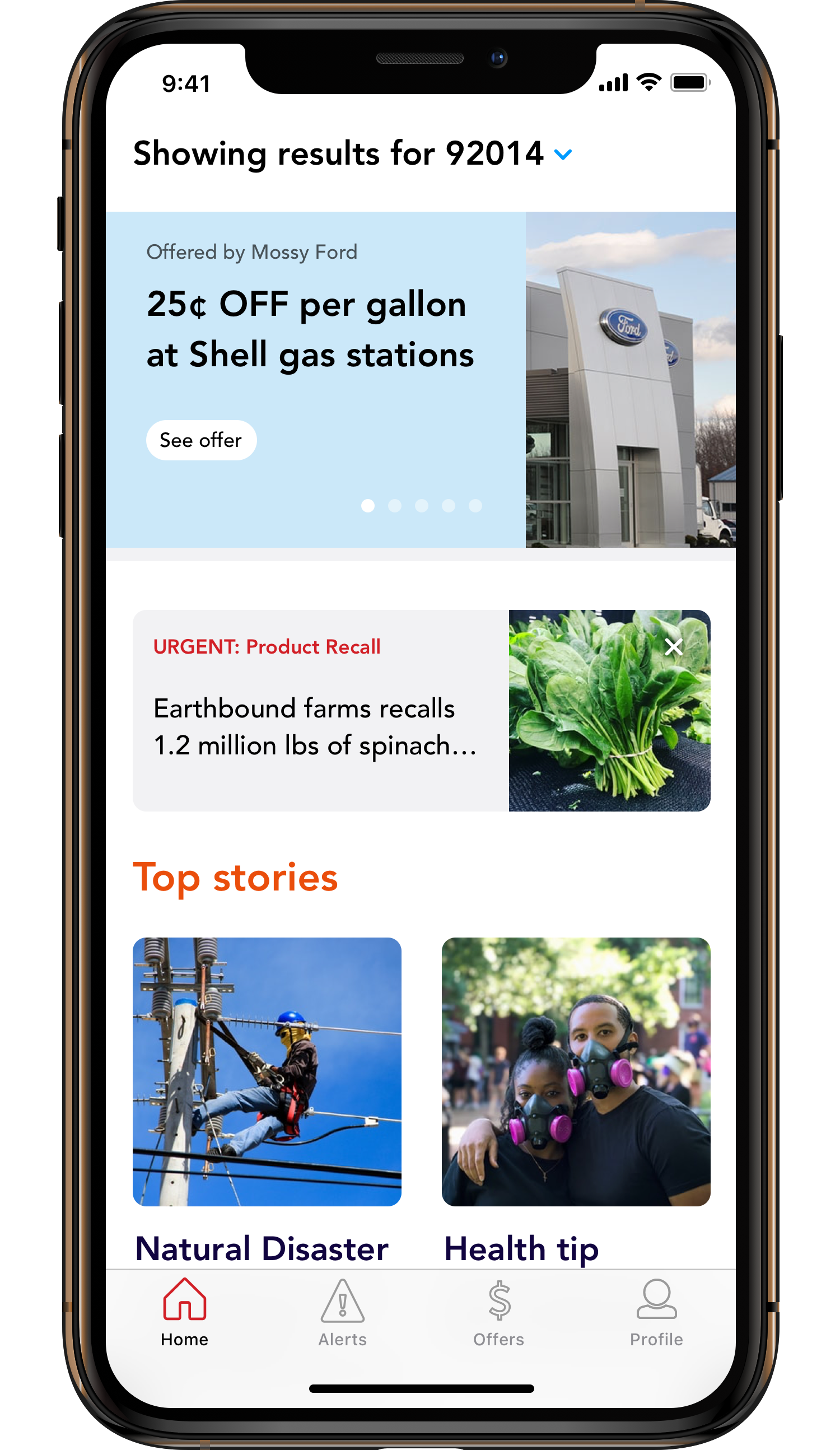
Our team concluded that in its current form Watch Out! wasn’t sufficiently addressing the key needs of our target demographic. We decided to redesign the home tab, recall tab, and profile tab. We also began exploring the development of new functionality informed by user insights.

Brainstorm Solutions
1. Explore user needs
2. Research competition and best practices
3. Sketch rough concepts


Bring it to Life
Product Concept, UI/UX, and Rapid Prototyping
There is strength in numbers. For prototyping concept feedback, I pulled in as many team members as possible to showcase design solutions for each of the needs uncovered by our user research.
Create high-level user flows to minimize steps taken for each action
Develop wireframes
Assess, critique, and adjust wireframes
Create empty state experience, error messages, etc.
Explore visual design patterns
Experiment with different styles, colors, and typography
Transform wireframes into mid or high fidelity mockups
Create guidelines to help technical team understand visual properties like size, style, positioning, etc.
Build interactive prototypes for internal team and/or users
Receive feedback, repeat if necessary


Design Outcome
It’s a process and it’s never over but here’s where we landed…
This process was incredibly fascinating and yielded new features and a completely redesigned experience. The main goal was to simplify the experience greatly while also allowing the user to fully dictate how much content they'd like to see. I was able to create a more usable product by:
Creating ONE place to view all tailored and relevant content (News, Alerts, Offers) in the 'Home' tab
Restructured content cells to feature images
Increased font legibility
Continuous scroll-style news feed algorithmically sorted based on the user’s location, previous article engagement, and top stories
Creating an expanded 'Alerts' tab that allows users to dive deeper into all safety notices by category in Alert Feeds
Allowed for users to adjust what they see in the 'Profile'
Branding bonus: recreated government feed icons
Creating a separate tab specifically for all offers in the 'Offer' tab
Highlighted potential savings
We moved away from the term 'Incentive' as this was not seen as a user-friendly term
Creating ONE place for users to manage all of their product inputs in the 'Profile' tab
Included a standardized way to add products, vehicles, zip codes, allergies, and more